August 25, 2015
The State of Salesforce is the focal point of the year for our corporate marketing team, representing the culmination of months of planning, data analysis, design, and promotion.
In this edition of our Behind the Scenes series, we take a look at how we constructed this year's survey, the design process, and our strategy for promoting the report across all of our channels.
Creating the Survey
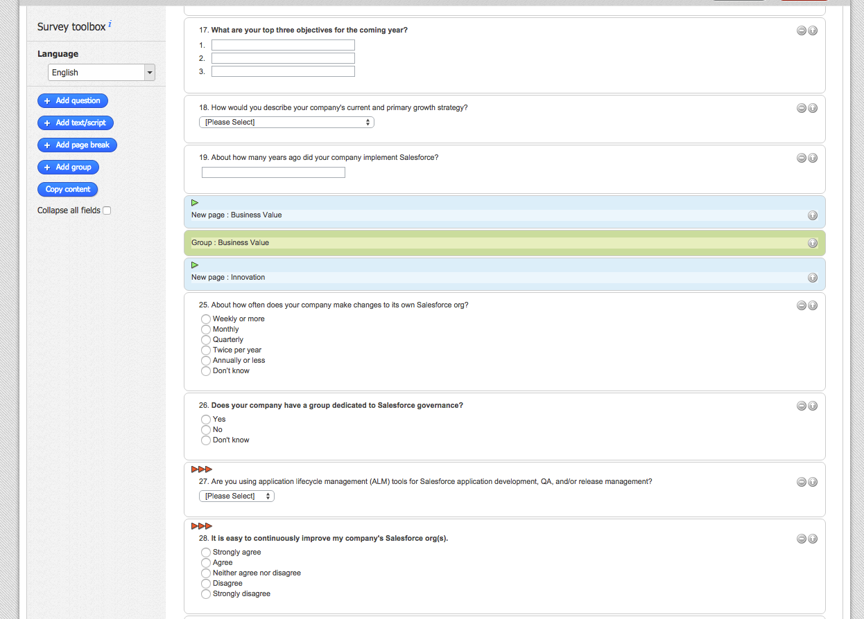
Before we decide which questions will make the final cut for The State of Salesforce, we create a positioning survey asking our executives and consultants what they're seeing in the field.
Questions like "What do your clients want?" and "What should your clients do right now?" give us a big picture view of what the most common pain points are, how companies are choosing to address them, and how existing solutions could be improved.
In addition to the responses we get from our consultants, we also keep in mind any big changes to Salesforce from the past year that were likely to impact users.
"We knew that survey takers would have new things to tell us about Analytics Cloud, governance, and the end user experience, so we came up with questions that targeted the areas of Salesforce undergoing the most change."
– Jonathan Staley, Product Marketing Manager
Once we have a blueprint for which topics to cover, we craft the survey to be as concise as possible while still accounting for each type of user. To accomplish this, we include questions like "What are your top three objectives for the coming year?" and "Which task do you do most frequently in Salesforce?".
Analysis and Design
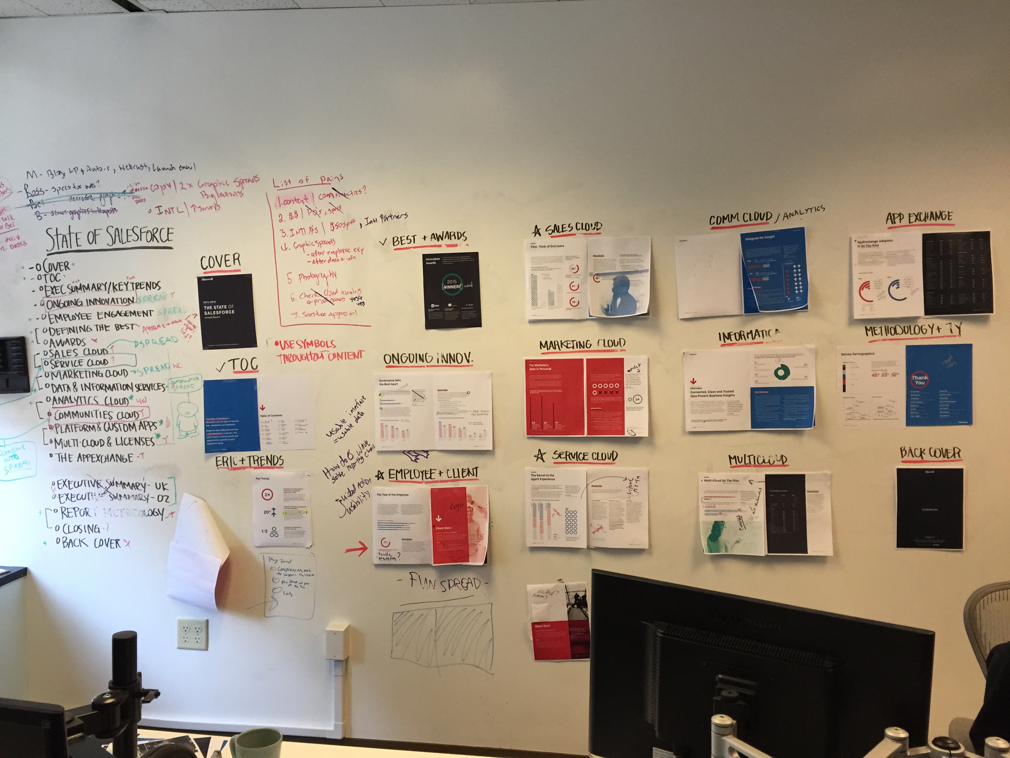
With the survey data in hand (and there's lots of it—over 1,500 responses from all around the world), we start looking for stand-out trends, large year-over-year changes, and correlation between questions.
Statistics that are particularly interesting get pulled into designs, and the report starts to take shape as sections are built, moved, combined, and reorganized to present the report's insights in a clear, visually appealing style.
To make it easy for everyone to see the most up-to-date version of the report at a glance, the design team continuously updates an entire wall of the office with printouts of each page in its latest form. This is where most of the discussion about copy and graphics takes place, and where we hold meetings to bounce ideas around about what could change.
Cross-Channel Promotion
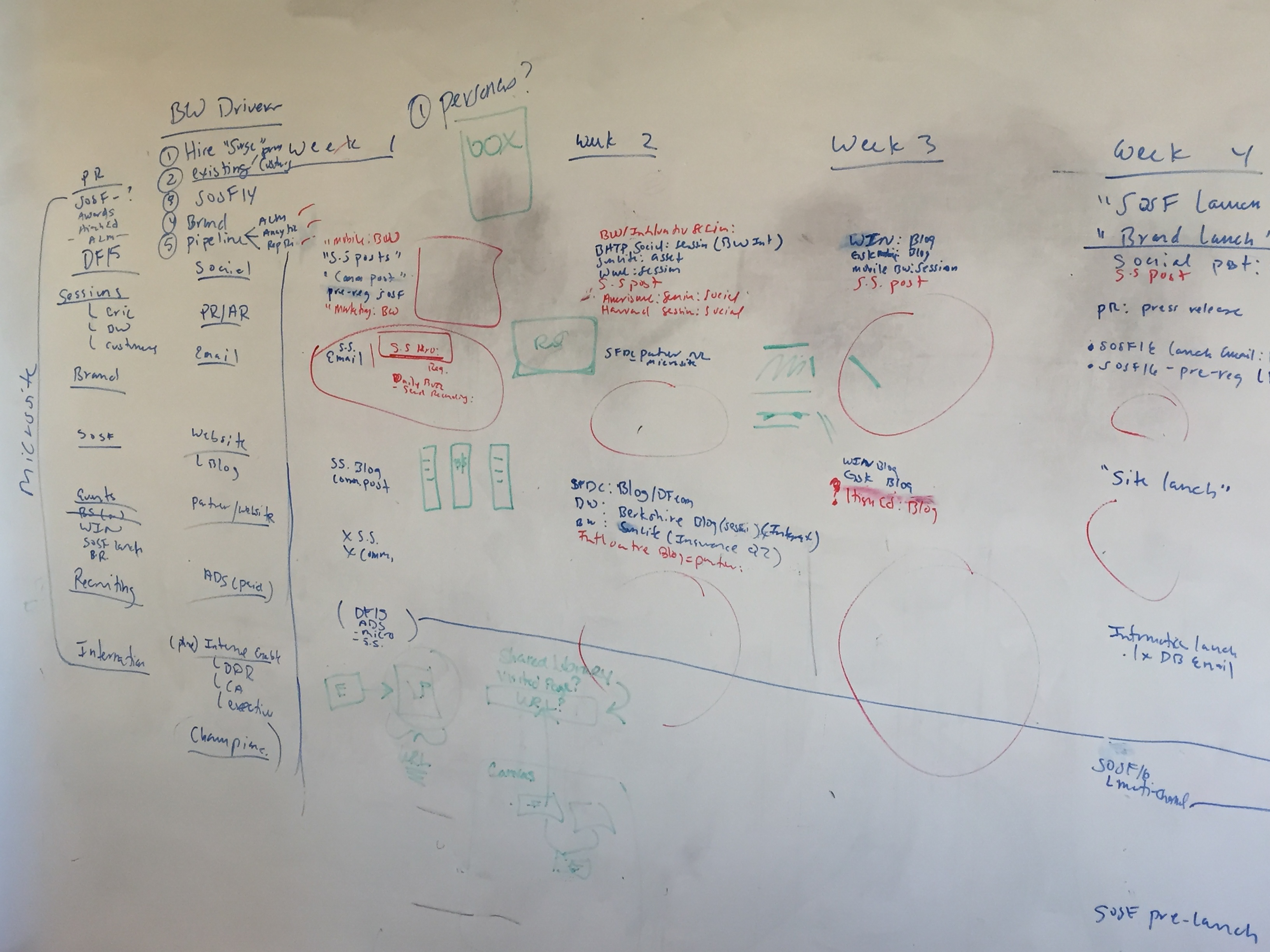
While the report's layout comes together, we consider how to promote the survey across our channels to start building momentum.
Using a calendar grid sketched out on another wall of the office, we're able to see all of our active campaigns from each channel's point of view, as well as the overall plan for the weeks and months leading up to the release of the report.
Our main goals are to keep our messaging and visual feel consistent while providing relevant content to email, social, and event audiences. This often means balancing the needs of multiple campaigns to make sure we're not sending too much of the same thing to someone's inbox, or posting too much similar content on social networks.
By keeping a shared calendar of all upcoming channel communications, we're able to quickly adapt our plans without worrying about potential conflicts with other campaigns.
Reserve your advance copy of The State of Salesforce today, and subscribe to our blog to be notified when new Behind the Scenes posts are published.
Have ideas for how we could improve The State of Salesforce? Let us know in the comments below, or tweet us @Bluewolf.


