November 7, 2013
Forms are one of the most powerful assets a marketing department has. As marketers, we know that forms often provide that crucial link between anonymous web visitors and actionable leads. Forms play a key role in the customer journey, kick-starting a path of personalized content, and forging a relationship between the customer and your organization. Unfortunately, most internet visitors are form-averse. Seeing a form can often prevent an individual from downloading content, getting support, contacting a company, or solving an issue. We must always keep this form reluctance in mind when designing tools for lead capture. Below, you’ll find ten tips for creating the perfect form—increasing conversions and boosting marketing ROI.
1. Don’t ask for the same information twice
Fight the urge to ask for First Name, Last Name, Email, and Phone on every form. If you’ve already collected that information before, do not ask for it again. This issue often comes up when clicking through an email. The sending company clearly has your email, it should use that stored information.
If you’re not comfortable with your organization’s data quality, think about pre-populating the fields. Make form fills quick for users by entering the information you already have. If they wish to change the values, they can. Tools like Eloqua & Marketo make it easy to add this feature.
Think of forms as a chance to gather more information. Use progressive profiling to ask for fields that you have not collected before - this will help you with advanced segmentation.
2. Standardize your fields (even if they’re hidden!)
Standardization, whether it be naming conventions or larger processes, will allow your team to grow and scale. By standardizing field names you will be able to leverage existing forms for new campaigns.
Hidden fields are also very powerful. You can use hidden fields to track lead source and campaign association, among other things. This will bring visibility into marketing performance and help determine the direction of marketing’s spend on future campaigns and what channels to invest in.

3. Limit the number of fields you use and make fields optional
We already know that long forms don’t convert well, however, data shows that the magic number of fields on a form is 4.
When you are deciding which fields to cut, think about the fields you plan to use in segmentation and personalization. Many companies are choosing not to remap first & last name for existing contacts in their CRM coming from a marketing automation tool or online form. If you aren’t planning on using them, don’t ask for them.
If not all fields are necessary for all segments, make them optional. If I say that I’d like to be contacted via email, don’t ask me for my phone number.
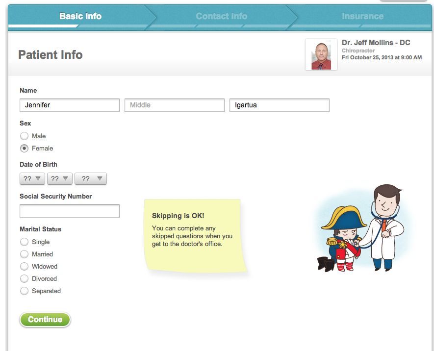
Zocdoc does this very well. You can choose to fill in your medical information before an appointment. They let you know right off the bat that “skipping is okay!” You can fill in as much or as little as you feel comfortable with.
4. Emphasize error location
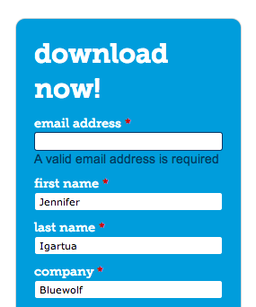
Nothing is more frustrating as a user than not understanding why they can’t submit a form. Make sure your error messages are precise, and eliminate user searching. You may also think about code that validates as you type.
Check out Bluewolf’s gated asset The 3 Pillars of Modern Digital Marketing. Try submitting it without filling in your email for example. You don’t get an obnoxious pop up, just some friendly text reminding you to fill out your email address properly.
5. Format fields appropriately
Radio buttons, checkboxes, picklists, and open text fields all have their place.
For something like agreeing to terms and conditions, don’t use a radio button, but instead a checkbox. That way a user can uncheck or check as they prepare the use a form.
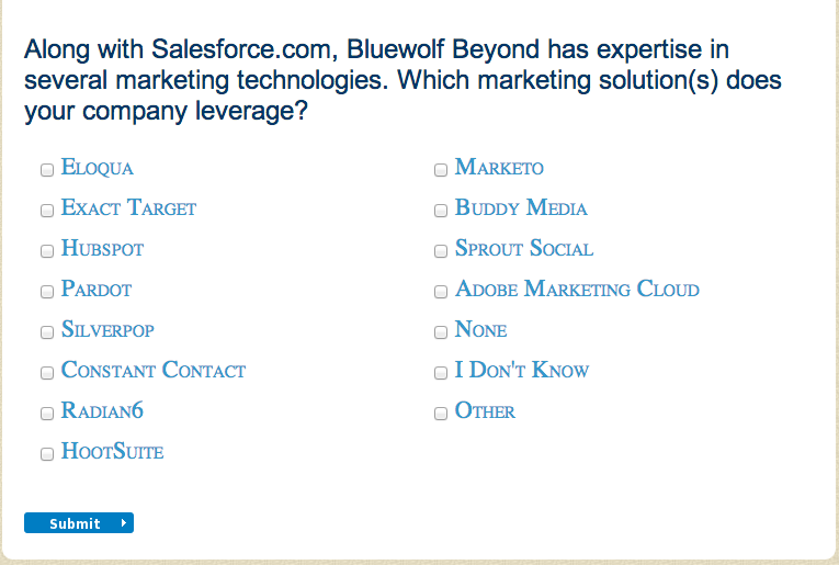
For questions that may have more than one answer, give users a way to select several choices, like a multiselect list. You may lose a conversion if a contact needs to pause to select a single answer. In Bluewolf’s survey below, we ask our customers which marketing technologies they are using. We allow users to select more than one answer, as they may be using several tools.
6. Be clear on the WIIFM (What’s In It For Me?)
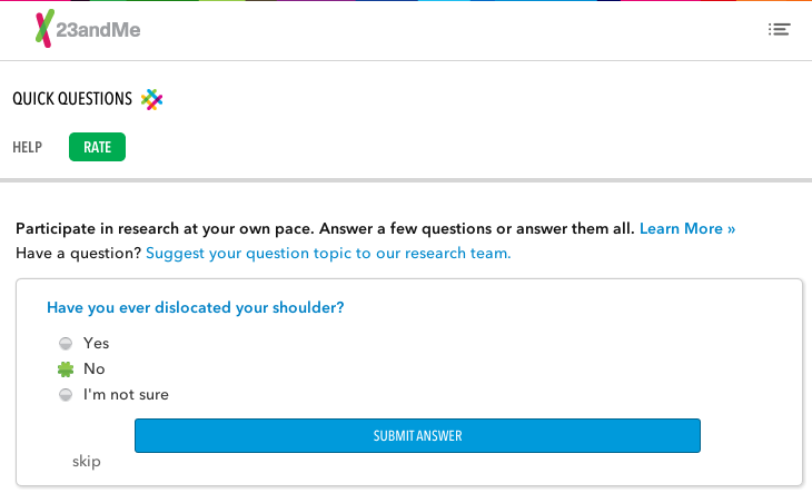
23andme, a company that provides rapid genetic testing, does this very well. They ask users for information to help bolster their database. By answering questions about yourself you are growing their database so that you can have more accurate analysis on your genetics. It is clear how submitting them will impact the visitor.
7. Give clarification to the word “submit”
Sometimes the word “submit” is not appropriate. The word submit actually performs worse than words like “click.” Increase conversion by adding more clarity to what the form will do. Think about calls to action like “click here to send this information to our support team,” or “click to receive your whitepaper.”
8. Leverage Social
You can increase conversion by leveraging social channels - allowing users to download a whitepaper or sign up for a free trial via facebook as opposed to filling out that form.
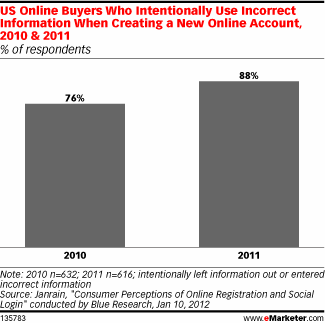
Social is especially beneficial for authenticating a user’s information (like email address). Social login platform Janrain, reported in 2011 that 88% of online buyers use incorrect information when creating an online account, up 12% from 2010.
There are many more benefits to leveraging social sign-on like increasing engagement and encouraging sharing through social channels and simplifying the registration process.
Give thought into what channel is appropriate. Twitter, Linkedin and Facebook all have different audiences (and privacy policies).
9. Give next steps
Think about what your user would like to see after submitting. Can you make redirects conditional based on the information submitted? If it’s a contact us form, when am I likely to hear back and through what channel?
Sending emails after a form submit can be useful, but sometimes a redirect page is all that’s needed. Let your user know that you’ll get back to them soon and that you’ve received the information. You can also use a thank you page to promote related material they may be interested in.
10. Finally, test your forms!
Test your forms for functionality and user experience. Have someone who wasn’t involved in the build process fill out the form and give you feedback. Remeber, you can always add new features to an existing form.
Bonus!
Don’t forget to think mobile. Seeing that mobile browsing is has doubled since 2009, it’s important to make your forms mobile friendly. Test on different types of phones and tablets (as well as multiple browsers) to make sure the user experience is a good one.
Want more marketing tips? See how you can develop a killer marketing strategy with our guide, The Three Pillars of Modern Digital Marketing.